bilingual/zweisprachig

Tuesday, October 13, 2015

Bernd & Hilla Becher

My first contact with their photography was the inner sleeve of the first Kraftwerk album: a transformer that never made it into one of their typologies. 

In a certain way, their work has always been history. Bernd Becher passed away in 2007, now also Hilla Becher is gone. Their photographic art will remain.


Mein erster Kontakt mit der Photographie der beiden war das Innencover der ersten Kraftwerk-LP: ein Trafo, der es anscheinend nie in eine ihrer Typologien schaffte. 

In gewisser Weise war ihr Werk schon immer Geschichte. Bernd Becher verstarb 2007, nun ist auch Hilla Becher gegangen. Ihre Photokunst wird bleiben.


Wednesday, September 30, 2015

Rediscovered - Lightwave: Nachtmusik


25 Jahre hat diese Scheibe auf dem Buckel. Wenn ich nicht irre, habe ich 1990 zur Veröffentlichung einen Pressetext für diese CD geschrieben, fand sie nicht weiter sensationell, und seitdem stand sie unbeachtet bei mir im Regal. Durch Zufall habe ich sie nun wiedergefunden und muss Abbitte leisten. Die Platte ist weit besser als ich sie in Erinnerung hatte.

Lightwave sind die französischen Elektroniker Christoph Harbonnier und Christian Wittmann. Die zwei langen Tracks (23 und 32 Minuten) sind in der Nacht vom 14. auf den 15. Mai 1989 unter Quasi-Livebedingungen im Studio eingespielt worden. Vom alten Modularsynthesizer bis zum Sampler ist alle denkbare damalige Elektronik vertreten. Das Booklet tut so, als sei die Musik mehr oder weniger improvisiert, aber das darf man bezweifeln – dafür sind mir die Stücke und besonders die Klangverläufe einfach zu ausgeklügelt. Das ruhigere „Nachtmusik“ macht den Anfang: Sanfte, scheinbar rhythmuslose Klangwolken, die herein- und vorüberschweben, sich dabei unentwegt verändern, als habe es damals schon den Morphingeffekt gegeben. Das muss sehr genau vorbereitet gewesen sein. Unweigerlich fühlt man sich atmosphärisch an „Plas“, das Auftaktstück des zweiten Cluster-Albums, erinnert, aber in „Nachtmusik“ sind die Klänge fließender und weniger harsch. Das zweite Stück, „Just Another Dream“, ist kantiger. Klare Rhythmen gibt es auch hier nicht, aber die Klänge sind härter, metallischer, fordernder; gelegentlich grüßt Meister Stockhausens „Kontakte“ aus der Ferne. Manchmal hat man das Gefühl, das Stück stehe kurz vor dem Stillstand, aber es geht weiter, zum Teil mit starken Dynamiksprüngen.

Lightwave hat einige weitere Alben veröffentlicht, die ich allerdings nicht kenne, zuletzt wohl 2004. Hintergrund der Veröffentlichung dieses Albums war seinerzeit nicht zuletzt die Tatsache, dass Michel Geiss am Mischpult saß und Erdenklang-Chef Ulrich Rützel über ihn Kontakt zum Team um Jean Michel Jarre bekam. Aber die Platte passte auch ins damalige Labelkonzept. Die CD würde manchem heutigen Laptop-Musiker gut zu Gesicht stehen und wird bei mir in Zukunft mit Sicherheit öfters rotieren.


This record is already 25 years old. If memory serves, I wrote a press release in 1990 for the release of the CD, but I didn't find it very sensational, and so it lived in my shelves since then, unheard and forgotten. Just by chance I rediscovered the record now, and I have to apologize. The record is much better then I remembered.

Lightwave are the French electronics Christoph Harbonnier and Christian Wittmann. The two long tracks (23 and 32 minutes) were recorded under quasi-live circumstances in a studio in the night from May 14 to 15, 1989. Every imaginable kind of electronic of that time is involved, an old modular synthesizer as well as a sampler. The booklet gives the suggestion that the music is more or less improvised, but I doubt this -- the tracks and especially the progression of sounds are too well-thought-out to be improvised. The record starts with the quiet "Nachtmusik": Soft, apparently rhythmless sound clouds come in and float away, permanently changing, as if there had been the morphing effect already at that time. They must have prepared this very carefully. The track reminds to "Plas" from the Cluster II album, but the sounds are more fluid and less harsh here. The second track, "Just Another Dream", is a bit more edgy. Also here are no recognizable rhythms, but the sounds are harder, more metallic, more demanding; sometimes Master Stockhausen's "Kontakte" seems to greet from far. From time to time the track seems on the way to stop, but it goes on, sometimes with high dynamics.

Lightwave recorded a couple more albums later, the last one apparently in 2004, but I don't know any of them. One reason to release this one was the fact that the mix was done by Michel Geiss, which gave Erdenklang head Ulrich Rützel the chance to get into touch with the team around Jean Michel Jarre. But the CD also fitted perfectly into the then label concept. This CD would be becoming for a lot of today's laptop musicians, and I'm sure I will give it a spin more often from now on.


(The German version of this review was first published on Manafonistas.)

Saturday, September 19, 2015

Last 2 Days


Macy's
Downtown Pittsburgh
Sep 19, 2015


Thursday, August 20, 2015

Electronic Music in 1966


Jean-Jacques Perrey and Gershon Kingsley, showing an Ondioline on U.S. game show "I've Got A Secret" in 1966. Apparently there is no other way to popularize instruments like this than giving them a sort of fairground sensation touch.

I remember seeing Hubert Bognermayr and Harald Zuschrader on Joachim Fuchsberger's TV game show "Auf Los geht's los" on German TV, probably around 1982. They had to demonstrate their Fairlight CMI sampler. The audience was told that this device could make music with every sound in the world, and the audience had to guess whether this was true or a lie. It worked -- sensation, sensation!


Jean-Jacques Perrey und Gershon Kingsley führen 1966 in der U.S.-Gameshow "I've Got A Secret" ein Ondioline vor. Anscheinend war es nicht möglich, solche Instrumente zu popularisieren, ohne sie als eine Art Jahrmarktssensation darzustellen.

Das erinnert mich an eine Ausgabe von Joachim Fuchsbergers TV-Spielshow "Auf Los geht's los", wohl um 1982, in der Hubert Bognermayr und Harald Zuschrader ihren Fairlight CMI-Sampler vorführen mussten. Dem Publikum wurde erzählt, dieses Gerät könne mit allen Klängen der Welt Musik machen, und die Leute sollten entscheiden, ob das wahr oder gelogen war. Es hat funktioniert -- Sensation, Sensation!

Friday, July 31, 2015

Hello, I am Erik

(Deutscher Text: Bitte runterscrollen!)

This book comes in day-glo orange, screaming at you. The photo doesn't really show how loud it is. And this color goes on inside the book, not only as page backgound, sometimes even as text color. The holes in the cover let you see three of the all in all 35 portrait photos on the half-title.

OK, it's possible to do it this way. However, I'm not sure whether we have to deal here with an especially original book design or a true design catastrophe. You'll be the judge. But this is something you have to be aware of when the topic is Erik Spiekermann.

Probably he wouldn't find it too funny to be called a "design guru", but nobody can deny that he's one of the most influential typographers and designers of our time. Whoever walks through the world with open eyes must have come into touch with his work already. Spiekermann designed several books for Germany's Rotbuch-Verlag, he made the typography for Deutsche Bahn, Deutsche Telekom, the information system of Berlin's buses and suburban trains, for WDR radio and TV in Cologne, for Bosch, for Audi, for Volkswagen and for the Düsseldorf airport, he also made the Corporate Design of the City of Glasgow, and hundreds of smaller works everybody has seen at least once. You can recognize his style after a while.

Often the typography of a book, a newspaper or a website is not even noticed. How else could it be explained that we are permanently filled up with Helvetica (or its Microsoft clone Arial) or Times New Roman as if there wouldn't be any other fonts in the world. Don't get me wrong, they are OK, they just are so overused that I have the feeling there is no thought behind it anymore when they are chosen. In the U.S. meanwhile even the names on gravestones are engraved in Times New Roman; probably because it's simply the standard typeface on every computer.

It might be a bit strange, but when I was a child I had an eye for fonts already, of course without being really aware of it. One of my early favorite books was "Jim Button and Luke the Engine Driver" ("Jim Knopf und Lukas, der Lokomotivführer" from 1960), and it was not only the story itself that sticked to my memory, it also was (and still is) the Palatino typeface it was set in. The same typeface was used for the very famous green edition of Tolkien's "Lord of the Rings" (the German version), and for me it is unseparably connected to this typeface. When years later I read the English version with its different typeface (a sort of a narrow Times variation), it changed the "coloring" of the story in at least the same way as the language did. For me, the music of Kraftwerk will always be connected to the good old Futura typeface they used for the Man Machine and Trans Europe Express covers, and they couldn't have found a more fitting one. Typography influences the sound of a book and all other lettered objects, and that means: It influences also the content itself. My first glance usually goes to the letters W, R, a and g, followed by the numbers 1, 2 and 5. They carry the substance of the whole typeface. I always found that the "g" in the logo of Munich paper "Süddeutsche Zeitung" looks a bit atrophied, somehow. A novel, set in Bodoni, is one story for me. The same novel set in Garamond sounds different for me, it's not exactly the same story. It has always been a mystery for me why most authors as well as editors obviously don't waste a single thought on finding the right typeface for the text they want to publish.

It's clear then that someone like Erik Spiekermann must be interesting for me. Not only because he knows his business thoroughly, but also because he's strong in his opinions. Johannes Erler, who wrote this biography, lets Spiekermann himself have his say, but he also asks many of Spiekermann's companions and collaborators, among them Neville Brody, Christoph Niemann or Stefan Sagmeister. The book is a collage of interviews, short essays, photos -- and of course lots of fonts and the process of their making. Sometimes fractions of a millimeter make a different character of the typeface, and you can see it here.

"Hello, I am Erik", by the way, uses only one single typeface, it's called "Real". But of course there are several variations. The book is available in identical styling in German and English language; at the end you'll find a code you can use to download a complete font set by Erik Spiekermann.


Johannes Erler:
Hello, I am Erik — Erik Spiekermann: Typographer, Designer, Entrepreneur
Verlag die gestalten, Berlin 2014
ISBN 978-3-89955-519-6


Das tageslichtleuchtende Brüllorange, in dem dieses Werk daherkommt, wird auf dem Foto nur unvollständig deutlich. Und diese Farbe setzt sich drinnen fort, nicht nur als gelegentlicher Seitenhintergrund, sondern manchmal sogar als Textfarbe. Die in den Buchdeckel eingestanzten Löcher geben drei der insgesamt 35 Portraitfotos auf dem Schmutztitel frei.

Na gut, kann man so machen. Ich bin mir allerdings nicht sicher, ob das Resultat nun eine besonders originelle Buchgestaltung ist oder eine echte Designkatastrophe. Tut mir leid, das muss jeder für sich entscheiden. Aber mit so etwas muss man wohl rechnen, wenn man es mit Erik Spiekermann zu tun hat.

Er wird es nicht besonders originell finden, als Designguru bezeichnet zu werden, aber dass Erik Spiekermann einer der wichtigsten Schriftgestalter und Designer der Gegenwart ist, wird man nicht bestreiten können. Mit seinem Werk ist jeder, der mit halbwegs offenen Augen durch die Gegend läuft, schon in Berührung gekommen. Er hat etliche Bücher des Rotbuch-Verlages grafisch und typografisch gestaltet, er hat Schriftdesigns für die Deutsche Bahn entworfen, für die Telekom, für das Informationssystem der Berliner Verkehrsbetriebe nach der Wiedervereinigung, für den WDR, für Bosch, für Audi, für VW und für den Düsseldorfer Flughafen, von ihm stammt das Corporate Design der City of Glasgow — und hunderte kleinerer Arbeiten, denen jeder mal begegnet ist. Mit ein bisschen Übung kann man seinen Stil sogar erkennen.

Oft wird die Typographie eines Buches, einer Zeitung oder einer Website gar nicht wahrgenommen. Wie anders ist es zu erklären, dass wir permanent mit der Helvetica (oder ihrem Microsoft-Klon Arial) oder der Times New Roman zugetextet werden, als gäbe es keine anderen Schriften auf der Welt. Wobei ich gegen diese gar nichts habe, sie sind nur schon längst so abgenudelt, dass keine Überlegung mehr hinter ihrer Nutzung zu stecken scheint. In den USA werden inzwischen selbst die Namen auf Grabsteinen in der Times New Roman eingraviert; wahrscheinlich einfach deshalb, weil sie standardmäßig auf jedem Computer vorhanden ist.
Ich habe seltsamerweise schon als Kind einen Blick für Schriften gehabt, ohne dass mir das damals bewusst war. Eines meiner frühen Lieblingsbücher, Michael Endes “Jim Knopf und Lukas, der Lokomotivführer” von 1960 war für mich nicht nur die Geschichte selbst, es war (und ist bis heute) auch die Palatino, aus der es gesetzt ist. Auch die grüne Ausgabe des “Herrn der Ringe” ist für mich untrennbar mit dieser Schrift verbunden; die andere Schrifttype der englischen Ausgabe (irgendeine etwas schmal geratene Times-Variante) verändert für mich die inhaltliche Färbung der Geschichte mindestens so stark wie die Sprache selbst. Die Musik der Gruppe Kraftwerk wird für mich immer gekoppelt bleiben mit der guten alten Futura — sie hätten für ihre Mensch-Maschine- und Trans Europa Express-Covers keine bessere finden können. Typographie bestimmt den Sound eines Buches oder überhaupt aller beschrifteten Objekte und beeinflusst dadurch auch den Inhalt selbst. Mein erster Blick gilt meist den Buchstaben W, R, a und g, dazu auch den Ziffern 1, 2 und 5. Sie tragen die Substanz einer Schrift in sich. Immer fand ich, dass das “g” im Logo der Süddeutschen Zeitung irgendwie verkümmert wirkt. Ein Roman, gesetzt aus der Bodoni, ist für mich eine Geschichte; derselbe Roman, gesetzt aus der Garamond, klingt für mich anders, er ist nicht dieselbe Geschichte. Es war und ist für mich ein Rätsel, weshalb so viele Autoren und Verlage offenkundig überhaupt keinen Gedanken daran verschwenden, für den Text, den sie veröffentlichen wollen, die richtige Schrifttype zu finden.

Klar, dass mich jemand wie Erik Spiekermann interessiert. Gerade auch, weil er nicht nur sein Handwerk versteht, sondern auch ein recht meinungsstarker Typ ist. Johannes Erler, der diese Biographie verfasst hat, lässt Spiekermann selbst, aber auch viele seiner Wegbegleiter und Mitarbeiter zu Wort kommen, darunter Neville Brody, Christoph Niemann oder Stefan Sagmeister. Das Buch ist eine Collage aus Interviews, kurzen Essays, Fotos — und natürlich jeder Menge Schriften und dem Prozess ihrer Gestaltung. Manchmal geht es um Millimeterbruchteile, die den Charakter einer Schrift verändern können, und das sieht man hier.

“Hello, I am Erik” verwendet übrigens nur eine einzige Schrifttype, “Real” genannt. Diese allerdings in etlichen Varianten. Das Buch ist deutsch und englisch in identischer Aufmachung zu bekommen; am Ende findet sich ein Code, mit dem man einen kompletten Fontsatz von Erik Spiekermann downloaden kann.


Johannes Erler:
Hello, I am Erik — Erik Spiekermann: Typographer, Designer, Entrepreneur
Verlag die gestalten, Berlin 2014
ISBN 978-3-89955-519-6


(Die deutsche Besprechung erschien zuerst bei manafonistas.de)

Saturday, July 18, 2015

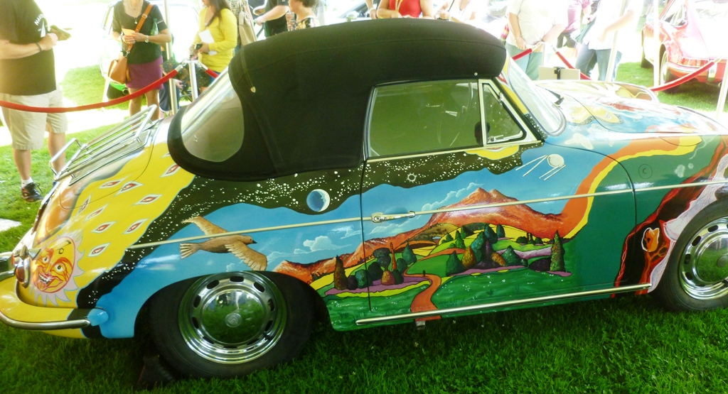
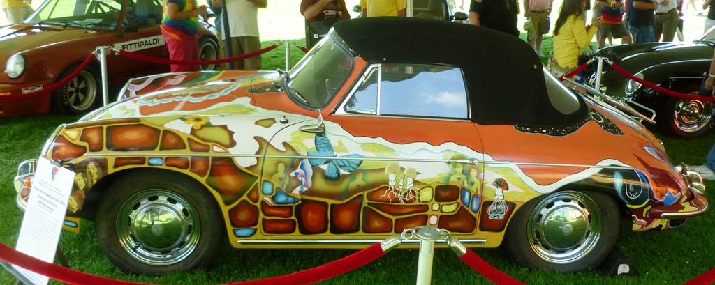
Janis Joplin's original Porsche

P1030921s

On view for two days at the Pittsburgh Vintage Grand Prix.

P1030919s

Her Porsche 956c Cabriolet, built in 1965.

P1030924s

Painting was done by Dave Richards, one of the Big Brother roadies.

P1030918s

Next year I would like to see Joe Meek’s Sunbeam at the Grand Prix.

Thursday, July 16, 2015

Now gone: A Muzak Artifact

Die Firma Muzak Holdings gibt es seit 1934, seit ihrer Pleite 2011 gehört sie zur Mood Media Corporation mit Sitz in Austin, TX. Die Firma lieferte individuell auf den jeweiligen Ort bezogene Berieselungsmusik; der Begriff "Muzak" ist darüber selbst zu einer Art Genrebezeichnung geworden.

Diesen wunderschönen alten Lautstärkeregler habe ich vor zwei Wochen in den Räumen eines Fotoateliers gesehen, das im 1. Stock des Kaufhauses Macy's in Downtown Pittsburgh untergebracht ist. 

Vor zwei Tagen, nach etlichen Jahren des Nachdenkens, Planens und erneuten Nachdenkens über eine Verkleinerung des viel zu großen Hauses hat Macy's nun angekündigt, den Standort komplett aufgeben zu wollen. Das traditionsreiche, dreizehnstöckige Haus soll nun für Apartments und ein Hotel genutzt werden. Nächste Woche beginnt der Räumungsverkauf.

Dieses inzwischen historische Fahrstuhlmusik-Artefakt dürfte damit für immer verloren sein.


Muzak Holdings existed since 1934. Since its crash in 2011 it's now part of Mood Media Corporation in Austin, TX. This company delivered non-stop background music, compiled individually for the respective place. The term "Muzak" became a sort of genre labeling itself.

I found this wonderful old volume controller two weeks ago in the rooms of a photo studio which is located on the 2nd floor of Macy's, Downtown Pittsburgh.

Two days ago, after years of thinking, planning and rethinking how to downsize the overdimensioned building, Macy's finally announced they will give up this location completely. The 13-floor building with all its tradition will now be used for apartments and a hotel. Next week the clearance sale will start.

This historic elevator music artifact will be lost forever then.